Harnessing the power of black colour psychology in marketing
Black is a bold and powerful colour, one that makes sense for your brand to integrate into your promotional product marketing. Learn more about what this colour means and how you can make the most of your branding. See clear examples of how black is best used to convey a strong message and overall cohesive branding strategies. Do you think you know everything there is about the colour black? Read more to find out, you might even learn something new!
Black is modern, bold, and certainly powerful. Black is elegant and serious, making it a colour full of contrast and meaning, making it a popular choice for brands. It can represent many draws attention, which makes it great for creating a strong and flexible visual identity.
Brands often rely on colour psychology to reinforce values and influence emotional responses. When choosing which colour to use, consider three key layers:
- Symbolic meaning
- Cultural meaning
- Psychological meaning
This blog explores all three in relation to black, and how this timeless colour can elevate a brand's image and presence.
The symbolic & cultural meaning of black
The meanings of colours often come from old traditions and sayings. However, modern British English still uses many of these phrases and sayings today.
For example, black humour refers to making light of dark or uncomfortable themes. Black sheep refers to someone who stands out from the norm. And to be in the black, means financial stability.
Cultural interpretations of black vary widely. In some cases, directly conflict with each other:
- In many Western cultures, black represents mourning, seriousness, and finality.
- In other cultures, such as Ancient Egyptian, black can symbolise fertility, rebirth, or transformation.
Because colour symbolism differs globally, it’s useful to be mindful of the target audience, particularly for international brands.
The emotional impact of black in marketing
As seen above, black can often have two sides of the coin. On one side, the colour can feel intense and dark. On the other side, a more positive one, black can show elegance and modernity. Which one a brand conveys, can make all the difference.
The heavier side of black
Humans are able to see black because black is the absorption of all other colours. This is why people often think of black as a deep and intense color. Psychologically, it can feel intense and isolating because it absorbs light. More ways to describe how black feels includes:
- Overpowering
- Heavy
- Oppressive
- Sadness
- Fear
- Depression
When used in large quantities, it can sometimes evoke feelings of seriousness or weight. It feels almost as if darkness consumes everything, like something sucks you into a black hole.
The sophisticated side of black
But black also carries strong positive associations. Through the use of the more positive emotions, psychologically, black communicates:
- Stability
- Luxury
- Professionalism
- Confidence
- Modernity
- Sophistication
- Sleek
Well-known British brands like Burberry, Barbour, and Rolls-Royce use black to show tradition, authority, and high quality. Darkness, in this case, can give an air of mystery and intrigue, for example, with the idea of a little black dress. The colour and design can be empowering and sexy, but also confidently and luxurious.
A quick note on grey
Right in the middle between black and white, is grey. Grey offers a softer, calmer alternative. While people still consider grey to be neutral, the colour tends to feel:
- More modern
- More harmonious
- Less intense
Top UK brands like Dyson, Jaguar, and Swarovski will often use metallic grey or silver as a black alternative. This colour shows innovation and style without being as heavy or daunting as black might be.
How black strengthens brand identity
Colour is often an audience’s first interaction with a brand. Therefore, there are many ways to use the colour black in all areas of a brand's presence. Black can be used in or for:
- Logo
- Website
- Packaging
- Physical products
- Marketing campaigns
Black is a favourite in corporate design because it's adaptable and universally recognisable.
Elevate customer engagement with black promotional items
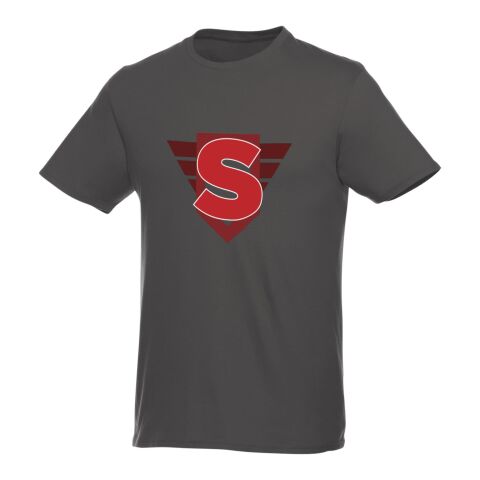
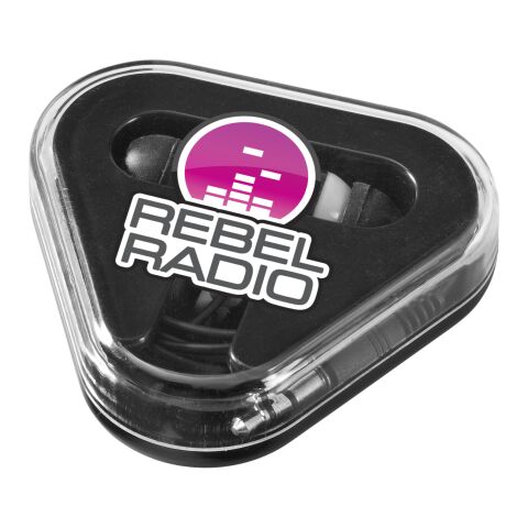
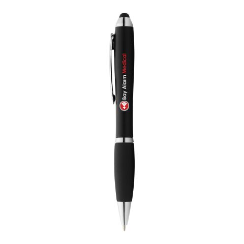
Promotional products have a unique tactile emotional impact. When they match a brand's colours, they create a seamless and memorable experience. A black product with a colorful design or a colorful product with black branding will stand out. Not to mention give it a more professional look and appearance.
Black promotional items offer several advantages:
- They look premium and timeless
- They suit nearly every industry
- They work well for every occasion
- They provide excellent contrast for coloured logos
- They feel sleek, modern, and professional
- Many product options for every type of product
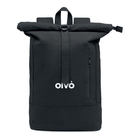
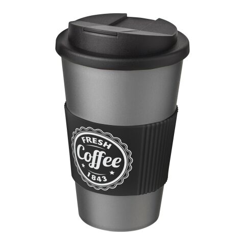
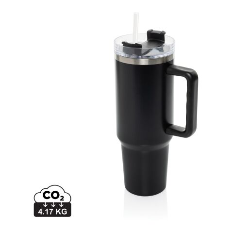
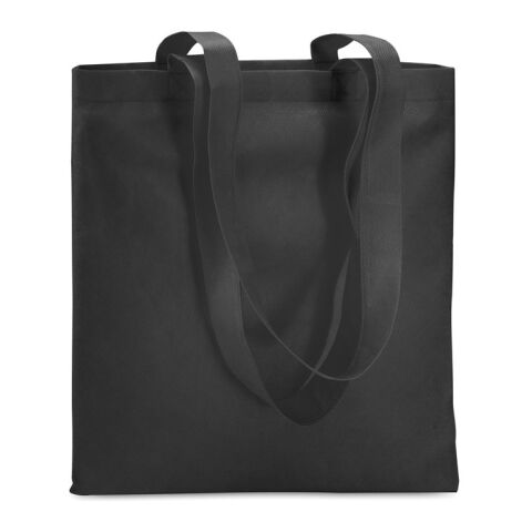
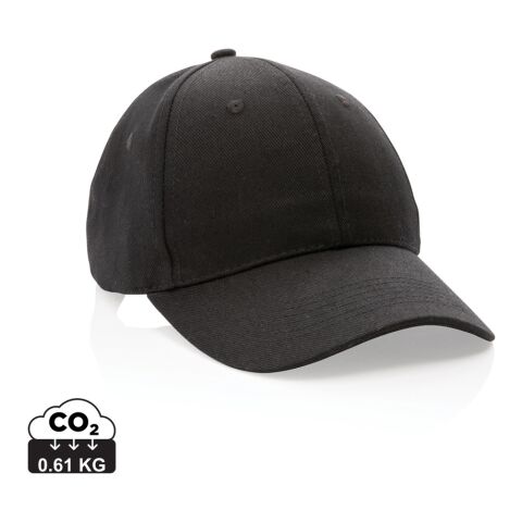
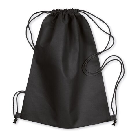
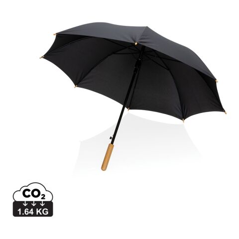
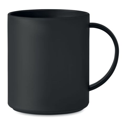
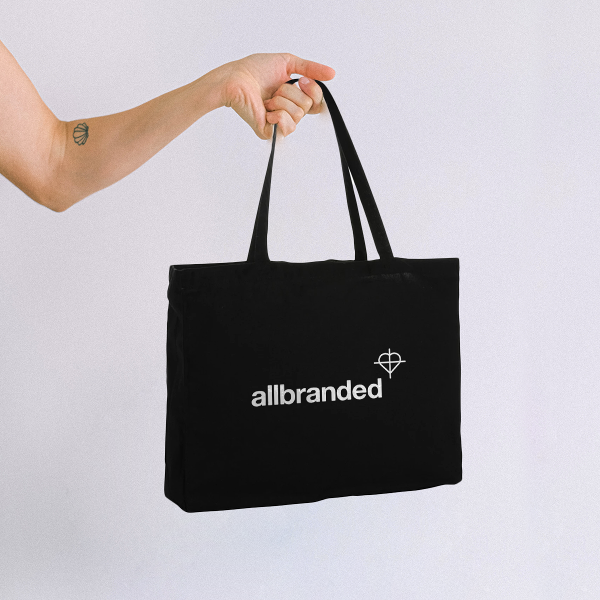
Products such as black notebooks, tech accessories, mugs, and reusable bags are popular in black. Companies often use them as corporate gifts and event giveaways in the UK.
Tips for text visibility on black promotional products
However, readability is essential - especially when printing text or images on black backgrounds. Consider these tips to make sure the branding is high quality on all products.
- Choose lighter colours or white for text to ensure the text can be see
- Avoid thin, delicate fonts as it makes it hard to read
- Add letter spacing (tracking) for clarity
- Always check a digital proof or print preview before approving production
💡 A quick check of the artwork can prevent problems later. It also makes sure the design looks good when printed. Which is why allbranded does not start production on any product until the customer confirms the print preview.
Using black in logo printing
A black logo on a colorful item can also make a strong statement, instead of the black product being the statement. The contrast helps the logo stand out and boosts brand recognition.
Perfect pairings
To use black as a standout colour, it makes sense to pair it with a brighter colour. The direct contrast between light and dark can give off an elegant or sleek modern appeal. Black or dark grey often works beautifully alongside more vibrant colours such as:
- Orange → Orange is energetic, warm
- Blue → Blue is professional, trustworthy
- Green → Green is balanced, natural
- Gold or yellow → Gold or yellow is premium and luxurious
- Red → Red is passion, urgency, and attention-grabbing
- White → White is fresh and modern, clean design
This makes it suitable for both serious and playful brands, depending on the combinations used. A pop of colour in contrast with black, especially when used on a logo, can set brands apart from others.
Final thoughts on black colour psychology in branding and marketing
Black is one of the most powerful and flexible colours in brand design. Whether used in the visual identity, website, packaging, or promotional merchandise, it communicates strength, sophistication and intention.
By carefully considering the color, brands can use black to create feelings and strengthen their overall brand message. By doing this, it creates meaningfully consistent customer experiences.



.png)
.png)

