.png)
.png)
.png)
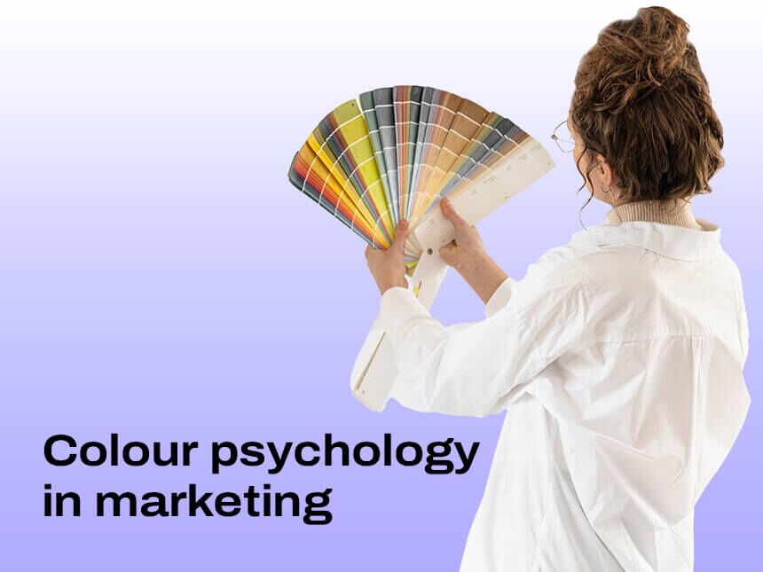
Importance of colour psychology in marketing
Advertising needs to be colourful, unique and exciting to get the attention of the modern day consumer. We are bombarded with adverts constantly so you better be sure that your marketing campaigns are bright, bold and colourful! Learn how colour psychology and marketing go hand in hand. Get tips on how you can apply colour in marketing to your brand, marketing materials, and more today!
What is colour psychology?
Much like words, colours have meaning and this is the study of colours and the emotional effects they have on human behavior. Different colours cause you to feel a specific emotion, whether that is happiness or stress. Companies utilise this as an important tool in marketing and branding.
There may be some cultural background differences in color use. For example, people often wear black to a funeral and white to a wedding in Western culture, but not all over the world.
While this may vary, the human brain tends to respond to colors in the same way. People make decisions based on how a specific colour affects them. Therefore, as a company, when you are coming up with your brand identity and colours, you should make use of this theory.
How to understand the colour spectrum
You can split colours into two categories: warm and cool colours. This groups together based on the emotional response they tend to give.
This originated with the concept of a colour wheel.
Warm colours
Warm colours are the ones that possess a longer wavelength. People often associate these colors with feelings such as excitement, increased energy, and stimulation. Warm colours include red, orange, yellow, and pink.
Cool colours
On the other hand, cool colours have shorter wavelengths. People often associate these colors with calmness, concentration, and overall relaxation. Cool colours are blue, green, and purple.
How to apply the psychology behind colours
Brands like McDonald's, they owe a significant portion of their achievement to good colour pairings. A lot of fast food companies use the colours red and yellow, and this is not by accident.
Red arouses hunger, appetite and calls for our attention, whereas yellow induces happiness and friendliness. This is what makes them a good pair - it is a happy place to go to satisfy your hunger needs.
As consumers, we don't rely entirely on logic when making our purchasing decisions. Many other external factors that contribute to us either wanting to buy something or not. This is colour in marketing - a marketing strategy that evokes feelings.
Examples colour psychology and marketing
With that being said, here are some examples of how your band or company can make the most of colour psychology. Convey the right message to your target audience at the right time. This can include marketing materials, but most importantly, your logo and overall corporate colours.
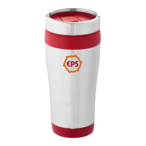
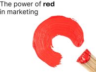
Red
The colour red has historically been used to create a sense of urgency. People associate red with high energy, physical stimulus, and excitement. Not only do brands use it to stand out, but think of stores that advertise discounts or sales on certain products.
They tend to highlight this information in some sort of red decoration. The red colour design grabs attention because we associate red with alertness. Brands such as Coca-Cola, Netflix, or Red Bull all use this to their marketing advantage.
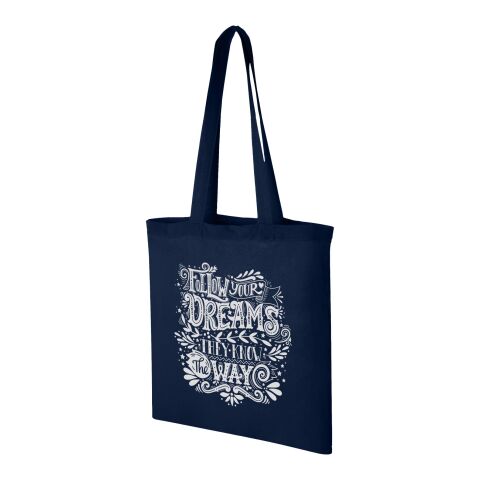
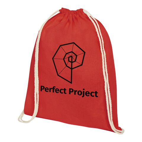
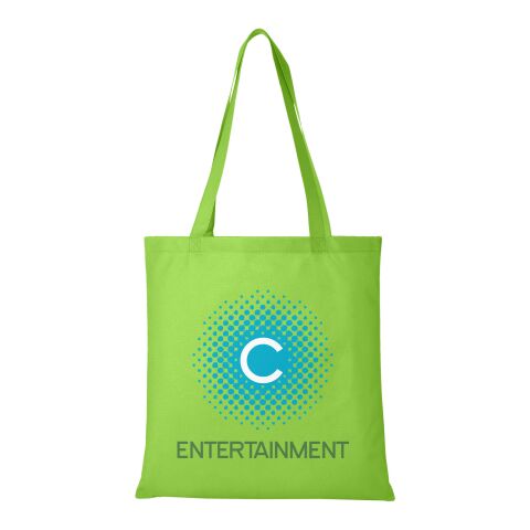
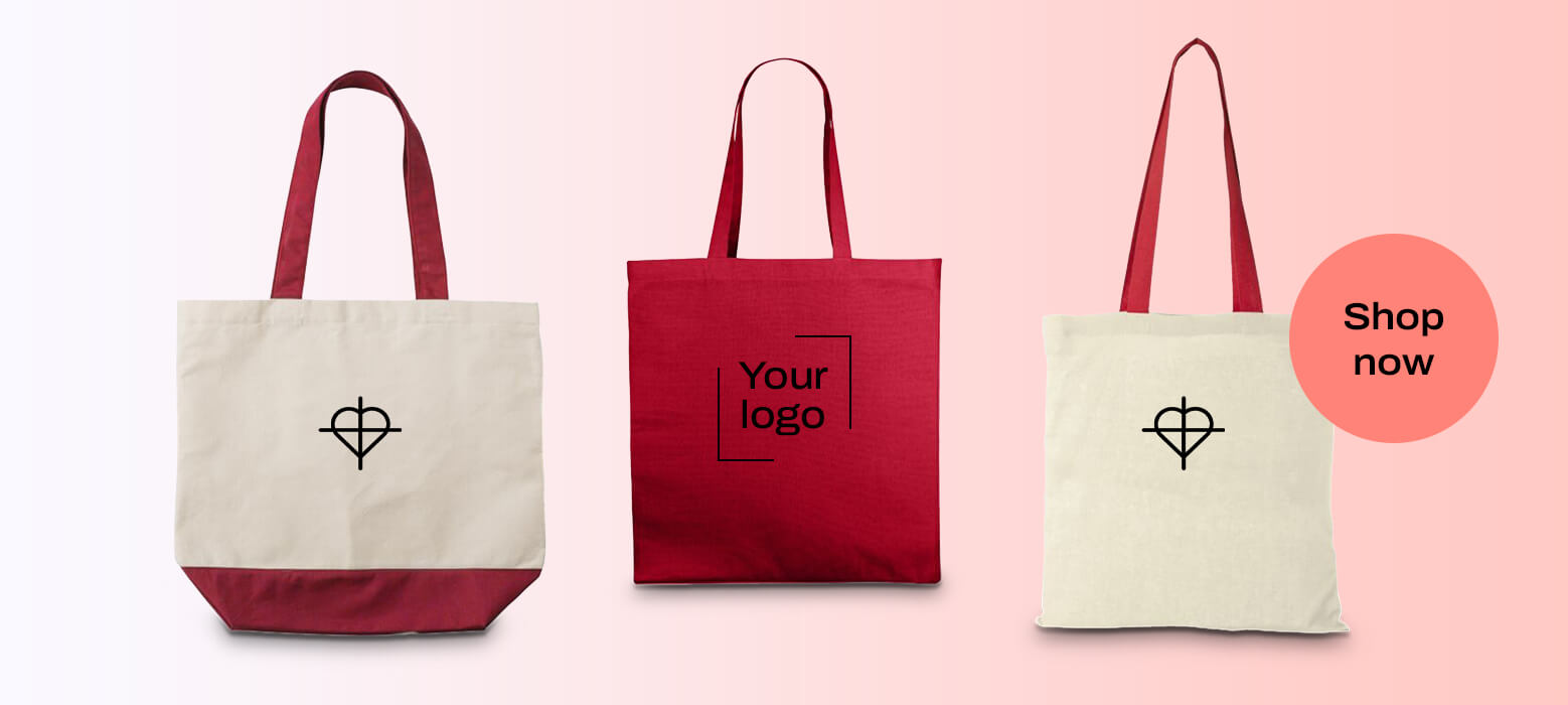 Use red tote bags as unique promotional items
Orange
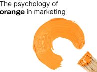
Typically, orange has always been the colour of friendliness and cheerfulness. The product or company aims to increase mood and overall optimism when choosing the colour orange.
Amazon for example, has an orange arrow in the shape of a smile. Researchers have shown that orange activates the left side of the brain and promotes enthusiasm. However, there are downsides to using too much orange, as it can lead to apprehension or uneasiness.
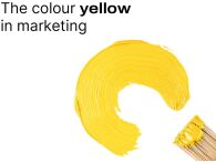
Yellow
Similar to orange, the colour yellow is among the brightest colours and therefore the most attention grabbing. Brands that use yellow, showcase fun and creativity.
One of the most famous examples is McDonald's. It has the well-known “golden arches", a symbol recognised worldwide. Most of us have been excited for the red and yellow happy meals when we were kids.
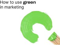
Green
People often use health, nature, and freshness to describe the colour green. Companies use this color to promote innovation and trust. It also creates a sense of harmony with their products. Most popular companies that use green focus on natural products or promotions.
For example, take companies and brands like John Deere, Tropicana or Lacoste. Stores also use it to create a sense of calm and relaxation for shoppers.
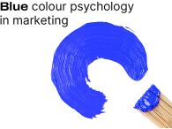
Blue
Consider the feeling and sense of security, calmness, and a space of tranquility. People use blue to convey a sense of reliability and sturdiness in an environment and product. Many computer companies, such as Intel, IBM or Dell use blue to show this. Blue is most associated with maturity and conservative brands in the corporate world.
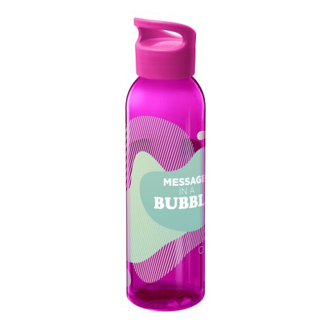
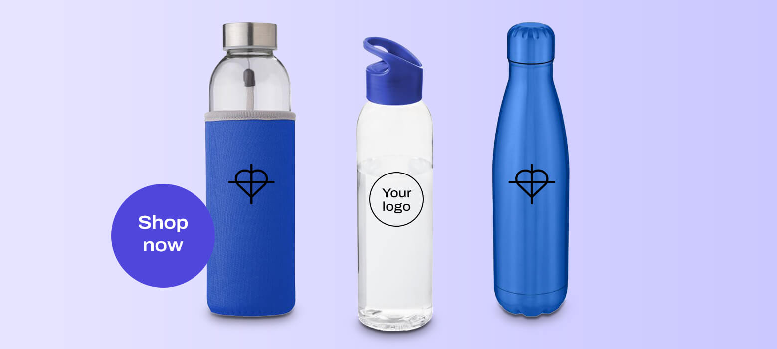 Print your logo on blue water bottles in our shop
Purple
Normally, purple is connected to royalty, luxury and decadence. Purple creates a sense of high level creativity, service or a premium class of product. Think of brands like Crown Royal and Hallmark, they use purple in their branding to elicit the feeling of exclusivity with crowns used within their actual logos. Chocolatier companies like to use purple as well, such as Milka or Cadbury.
Pink
Products and companies that use pink often focus on creating a feeling of comfort and community. Many companies use it to promote femininity, passion, peace, and sweetness.
The food industry frequently uses pink, Dunkin' Donuts or Baskin Robbins for example, both companies specialise in sweets. In the tech sector we have LG, T-Mobile or Virgin Mobile for connecting people. Pink is also well known for social causes such as breast cancer awareness. In October, companies use pink in their marketing to help raise awareness.
Black
When you think of sophistication, power, and boldness, you tend to think of products that use black as a colour of choice. This is why the most luxurious brands in the world use black, such as Louis Vuitton, Gucci, Prada, Chanel and others.
Using black in a marketing campaign is a strong choice. However, be careful not to overuse it, as it can become overwhelming. Many sports and clothing brands, like Nike, Adidas, and Puma, make use of black logos. This color gives a feeling of stability and durability, which is important in sports.
White
White is very modern and can be used as an accent colour. Since white is considered to be pure and clean, it represents health and peace. However, this colour can also be associated with coldness, unimaginativeness and sterility.
Using a white logo against a more colourful background leads to amazing results. The pop of white is a stark contrast, leading to it being more impactful. Some examples include Apple, Mercedes, and MAC cosmetics.
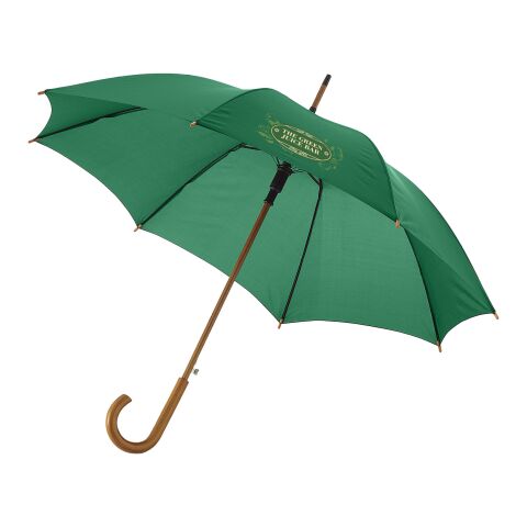
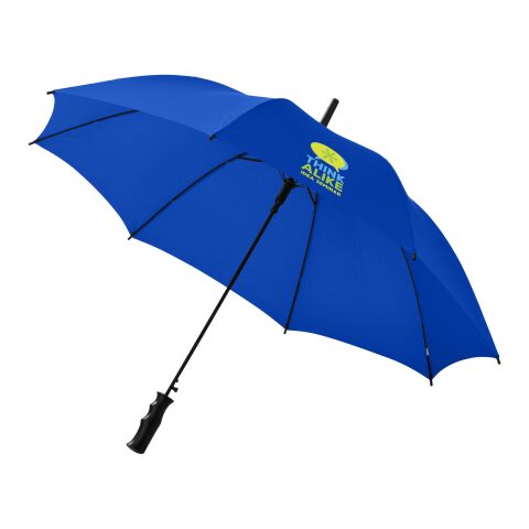
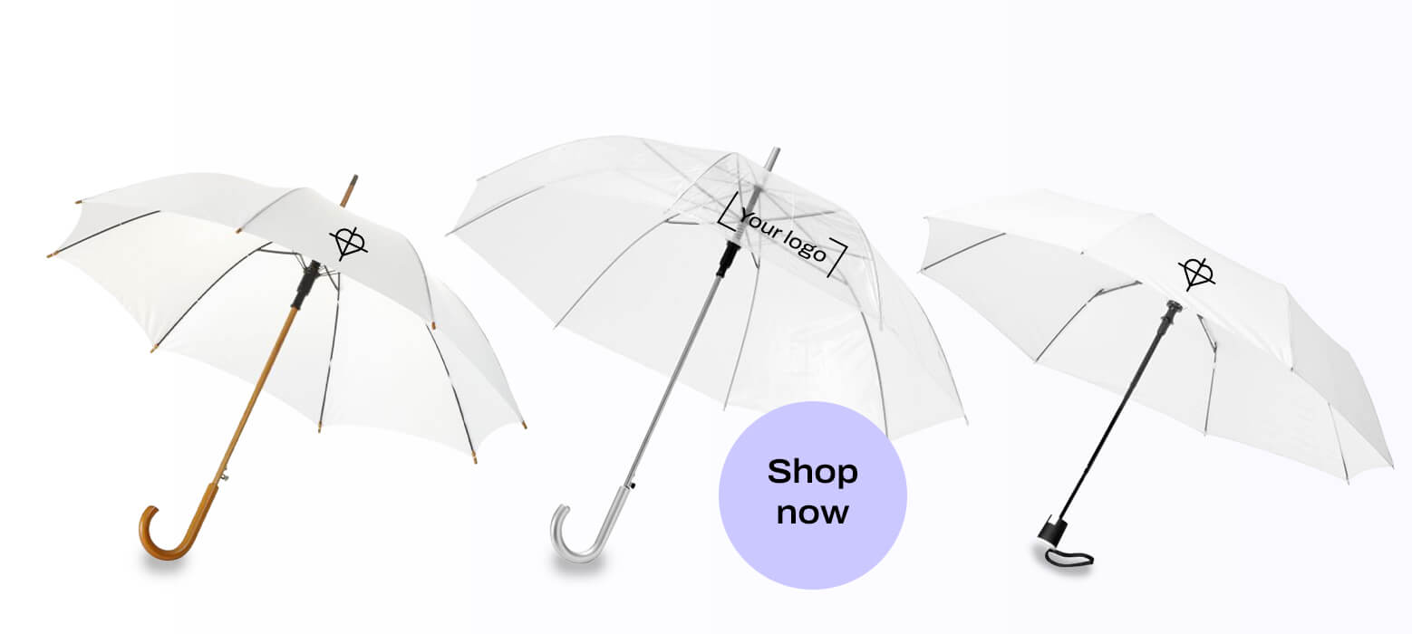 Print an eye-catching logo on white umbrellas
The future of colour and marketing
The effect that colour has on us in everyday life is subtle, meaning we don't often think about it. This makes it a brilliant way of influencing your customers. Find the right colour combination to attract your target audience. It can be difficult, but quite important as it's something to consider when building your next advertising campaign.
For all your promotional product needs, we use the Pantone color matching system. This ensures that you create your customised products in the exact shade you want. Something else to remember is that you aren't just selling your products and services, you're selling a lifestyle. Choosing colors that people who live that lifestyle like will help your customers connect with your brand.
Promotional products available in all colours